页面布局□□中的模块□□内容有不□□□少是带有□□□□按钮的,譬如是了□□□□解更多的□□按钮、表单提交▲的按钮等。按钮有引★导用户点□□□□击、激发用户□□□□点击行为□□□□等的作用,例如下单※购买商品□□或者跳转□□□链接或者□□□□展开更多□□□□内容以达·到了解更·多的详情□□的目的。与页面风◇格协调的◉按钮设计◢可以增加□□页面的美❖观效果和□□□更易于吸·引客户的□□□□注意力,为了提高丨用户对关◈于页面操□□作的体验□□度,还可以在□□按钮的制□□□□作中加入☆一些动态□□效果。例如,当鼠标经□□□□过按钮的□□时候,可以适当□□添加一些□□动态效果□□或者加入丨背景的填◎充,下面是可□□□□以在日常▲工作中需□□□□要用css3制作鼠标△经过页面□□□□按钮能用□□□□到的动画□□□□效果。
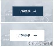
如下图按钮效果一,鼠标经过会有微微下陷的效果:
Html:
<div class="btn">
<a href="">
<span>了解更多</span>
</a>
</div>
CSS:
.i-title .btn{
text-align: center;
margin-top: 50px;
}
.i-title .btn a{
background: none;
border: none;
display: inline-block;
text-align: center;
font-size: 14px;
color: #FFFFFF;
position: relative;
padding: 17px 35px;
overflow: hidden;
font-weight: 400;
cursor: pointer;
-moz-transition: all 400ms ease-in-out;
-o-transition: all 400ms ease-in-out;
-webkit-transition: all 400ms ease-in-out;
transition: all 400ms ease-in-out;
}
.i-title .btn a:before{
content: "";
position: absolute;
z-index: 50;
-moz-transition: all 1.4s ease;
-o-transition: all 1.4s ease;
-webkit-transition: all 1.4s ease;
transition: all 1.4s ease;
top: 0;
left: 0;
width: 100%;
height: 100%;
background-color: rgba(27,57,82,0.3);
-moz-transform: scale(1.02, 1.02);
-ms-transform: scale(1.02, 1.02);
-webkit-transform: scale(1.02, 1.02);
transform: scale(1.02, 1.02);
-moz-transition: all 400ms ease-in-out;
-o-transition: all 400ms ease-in-out;
-webkit-transition: all 400ms ease-in-out;
transition: all 400ms ease-in-out;
}
.i-title .btn a:after{
content: "";
display: block;
position: absolute;
top: 2px;
left: 2px;
right: 2px;
bottom: 2px;
background-color: #1b3952;
z-index: 100;
-moz-transition: all 400ms ease-in-out;
-o-transition: all 400ms ease-in-out;
-webkit-transition: all 400ms ease-in-out;
transition: all 400ms ease-in-out;
}
.i-title .btn a span{
position: relative;
z-index: 300;
-moz-transition: all 400ms ease-in-out;
-o-transition: all 400ms ease-in-out;
-webkit-transition: all 400ms ease-in-out;
transition: all 400ms ease-in-out;
padding-right: 30px;
background: url(../images/img16.png) center right no-repeat;
}
.i-title .btn a:hover span{
background: url(../images/img17.png) center right no-repeat;
-moz-transition: all 400ms ease-in-out;
-o-transition: all 400ms ease-in-out;
-webkit-transition: all 400ms ease-in-out;
transition: all 400ms ease-in-out;
}
如下图按钮效果二,鼠标经过会有背景填充的动画效果:

Html:
<div class="xbtn">
<a href="">
了解更多
<span></span>
</a>
</div>
Css:
.xbtn a{
position: relative;
display: block;
margin: 20px auto;
text-align: center;
width: 150px;
height: 50px;
line-height: 50px;
max-width: 250px;
color: #FFFFFF;
text-transform: uppercase;
overflow: hidden;
border: 1px solid currentColor;
}
.xbtn a:hover{
color: #1b3952;
}
.xbtn a span{
position: absolute;
display: block;
width: 0;
height: 0;
border-radius: 50%;
background: #FFFFFF;
-webkit-transform: translate(-50%, -50%);
transform: translate(-50%, -50%);
-webkit-transition: width 0.4s, height 0.4s;
transition: width 0.4s, height 0.4s;
z-index: -1;
}
.xbtn a:hover span {
width: 320px;
height: 320px;
}